WordPress als App
February 8, 2023
What is a PWA? The term Progressive Web App (PWA) simply refers to a website that functions as…
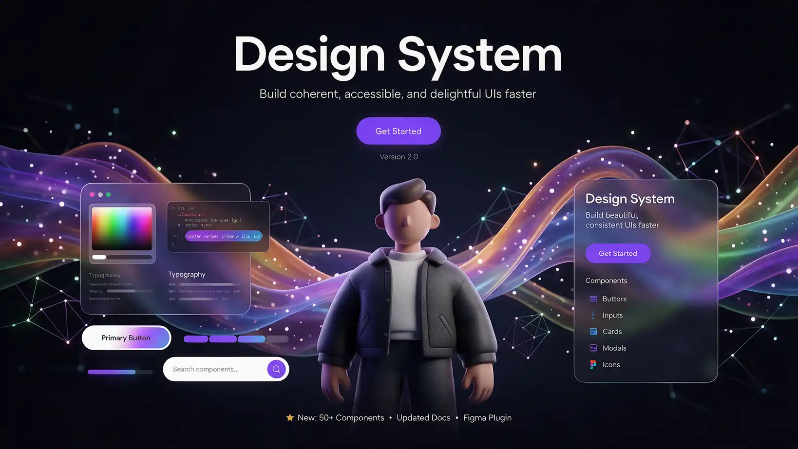
A design system defines the colors, fonts, logo, and building blocks of your website before the first page is built. This allows you to see how your website will look early on and avoids any surprises at launch.
Many website projects follow the same pattern: The agency spends weeks building, then comes the big presentation. Only then does the client realize that the blue is too cold or that the font doesn't suit the industry. Every change at this stage costs time and money because it affects every page.
With a design system, we reverse this order. First, we define the visual foundation together with you, then we build it. What you approve in the design system will later be visible on the finished website.
A design system is the set of rules for the appearance of your brand on the web. You can think of it like a construction kit: all the parts are clearly defined once and then used consistently everywhere.
These typically include:
The major advantage: New pages, landing pages, or even social media posts can later be created from the same building blocks. Your online presence remains consistent, even as it grows.
Many people are familiar with the term moodboard. A moodboard is a collection of images, colors, and sample pages that capture a mood. It answers the question: What feeling should the website convey?
The design system goes a step further. It transforms this mood into binding rules: precise color values, specific fonts, finished buttons, and spacing. The mood board is therefore the starting point, the design system the foundation for implementation. With us, the two flow seamlessly together: your favorite examples form the mood board, and from that, the design system emerges.
Colors determine in seconds whether a website appears serious, playful, elegant, or technical. A good palette usually consists of four to six colors that complement each other well.
Here's how we proceed:
Example: For an upscale restaurant right on the lake, muted petrol and mint tones, a bright white with a bluish tint, and a warm peach tone as an accent would be suitable. The palette evokes water and sunsets while still appearing sophisticated.
Typography is voice. A classic serif typeface conveys trustworthiness and tradition, while a clean sans-serif typeface appears modern and businesslike. We usually combine two typefaces: one with character for headlines and an easily readable one for body text.
For the AI to work with the correct font, it needs a clear specification. There are two simple ways to provide this:
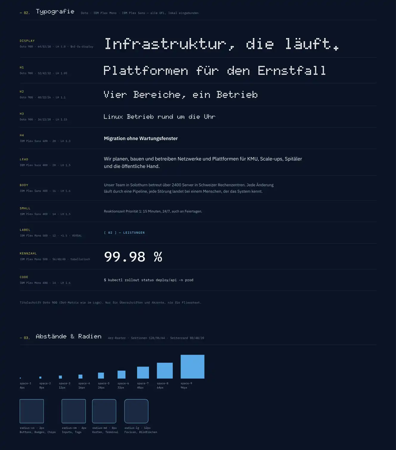
Real-world example: Our own website, amplus.ch, uses Merriweather for headings and Konnect for body text. The serif font inspires trust, while the sans-serif font ensures good readability on screen.
Important for Swiss SMEs: We integrate fonts directly onto your server in compliance with data protection regulations, instead of loading them from Google every time a page is requested.
Previously, a design system was a complex project that only larger companies could afford. AI has fundamentally changed that. Today, we can create an initial draft in a very short time, including logo, colors, fonts, and the most important components.
This has three advantages for you:
The AI provides speed and variations, while the experience and visual expertise come from us. No design goes to you unchecked.
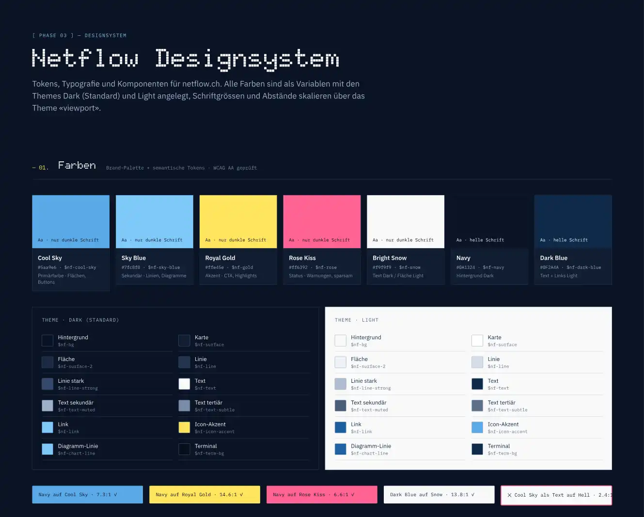
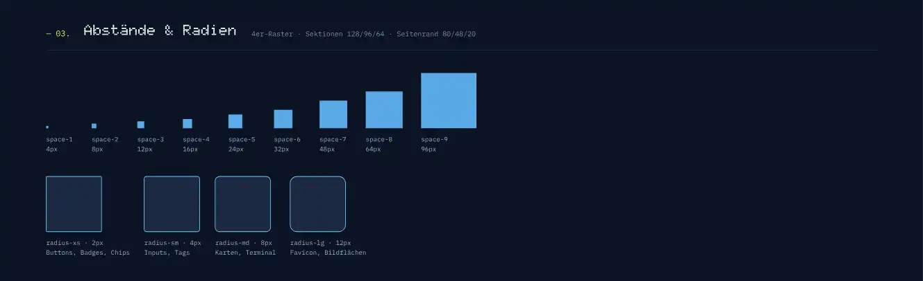
A single overview shows you all the decisions that shape your website. We'll discuss this page together before implementation begins.
Changing the color in the design system takes minutes. The same change on a finished website with twenty pages can take hours. That's why it's worth discussing aesthetics right from the start.
There are also other advantages that are often underestimated:
A design system transforms a gut feeling into a clear template that you can see, review, and help shape early on. Thanks to AI, this step is now quick and affordable. The result: a website without unpleasant surprises.
How the design system fits into the overall process of modern website creation is shown in the article "Website creation in the AI age: a practical test ".
Would you like to see your design system before committing? Contact us at +41 44 535 00 55 or via the contact form. We will create an initial draft for you.
Step 1: Write to us!